 |
| combined screenshots from Final Fantasy 12 (PS2, 2006) and Final Fantasy 12 HD (PS4 Pro, 2017) |
I'm currently playing the remastered PS4 version of Final Fantasy 12 ("The Zodiac Age") and it's still the same old nonsense story about fantasy imperialists and magic crystal macguffins. One thing that surprises me, though, is how this remastered version actually looks worse -- it went from the apex of PS2-era 3D art to looking like a mediocre PS3 game running on a PS4.
When it first came out 17 years ago (!), the Playstation 2 famously had very little texture memory (4 MB!) and no texture compression (!) which meant developers had to get creative. Loyal readers of this blog know of my love of lightmap atlases and UV layouts, and so I'd like to talk about how the textures for the original Final Fantasy 12 on PS2 were utter masterpieces produced under severe constraints -- cramming so much detail into these small texture sheets, down to the pixels...
 |
| texture sheets from Final Fantasy 12 (PS2) for the Vaan and Ashe characters, enlarged 2x (256 > 512) |
As efficient as it is, there are a few drawbacks to this technique. Symmetrical UV mirroring means you want to avoid noisy high frequency details, and make sure your textures are relatively clean or homogeneous -- it would look weird if you had symmetrical scars on your face, or symmetrical patterns of dirt on both of your arms, etc. I think this symmetry explains why the Final Fantasy 12 skin tones are so boring and flat, and why Vaan's abs looked so weird -- it has to look flat in order to look consistent.
Compare this relatively restrained style to the gratuitous phototexturing style of something like Quake 3 Arena, which technically shipped in 1999 (7 years before Final Fantasy 12) but demanded at least 8 MBs of video memory from gamer PCs. Notice how these skins push every bevel and muscle group to its breaking point:
 |
| wide collection of different Quake 3 character skins by the legendary Kenneth Scott |
 But notice how the Quake 3 skins make less use of symmetrical mirroring. Here, the artist Kenneth Scott rarely mirrored the chest or the face, but he did mirror less noticeable areas like arms, legs, and the butt.
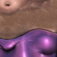
Look at that one solitary shiny butt cheek on the wrestler texture, with the purple pants -- look at how round that looks. Just look at that crotch bulge, look at that ass cheek! To push those highlights and bulges, you need to make a lot of assumptions about lighting and volume that Final Fantasy 12 couldn't necessarily make.
Final Fantasy 12's character textures also prioritize UV distortion and alignment more than Quake 3 -- how easy is it to paint on this texture? With more photographic / realistic art styles, you can usually care less about distortion and alignment because of all the noise and surface detail. Notice how the lines and UV boundaries in Quake 3 go all over the place, at all angles (which works for Quake 3!) but in Final Fantasy 12, every texture segment is orthographically aligned along 90 degree angles, with many thin horizontal / vertical lines. That's because they want every line to pop.
 |
| enlarged x4 section of fancy ornate garters on a character texture sheet from Final Fantasy 12 (PS2) |
In this way, the original Final Fantasy 12 represents a high-point in this era of 3D game art. This old school low-polygon low-resolution handpainting style involved a special mix of realism with pixel art sensibilities, and you don't really see this thing anymore in games.
Architecture has this idea of material honesty / "truth to materials", where you shouldn't make concrete try to look like old stone bricks, or build old castles out of steel. I think these vintage PS2-era handpixeled textures are a great example of a digital form of truth to material, an art direction borne out of specific hardware constraints, borne of the metal itself.
Now, the characters in the FF12 remaster look cohesively repainted and remastered. I have no real complaints. There, the Chinese remastering firm Virtuos "performed the honesty" well enough... but I think the rest of the game leaves a lot to be desired.
 |
| GIF comparison between original Final Fantasy 12 (PS2, 2006) and Final Fantasy 12 HD (PS4, 2017) |
You can easily automate Photoshop to do this for you, in literally a minute, for entire folders of textures, and I imagine that's what the dev team did here. But this is basically the same attitude that resolution-obsessed "HD graphics" modders inflict on games too, resulting in the fussy (and creepy) art direction of stuff like FakeFactory.
The
 |
| too much contrast, sharpening, and overlay... a disappointing mess of a wall |
On the PS2, the game's environment and characters looked cohesive and balanced, albeit blurry and aliased and low-res (like any other PS2 game played on a CRT television). Still, every cinematic shot was reasonably composed, and you basically knew where to look. Everything looked like it belonged together.
But here in this remaster, the entire world is practically screaming at you. "LOOK AT THE DIRT AND GRIME ON THIS WALL!!!"
And that's not a particularly honest nor interesting thing for a wall to say... it's just loud.
OVERALL SCORE: 7/10
- This PS4 remaster is OK I guess, but really, Final Fantasy 12 probably looks best on a PS2 emulator.
(Special thanks to Brendan Byrne for his rant that got me started on this line of thinking.)