Showing posts with label levels to look out for. Show all posts

Wednesday, June 15, 2022

Postcards from Quakeland, 2022


Some random notes and thoughts from Quake modding land, in this cold wintery June of 2022:
  • Community Hubs
  • Official Mods
  • The Future of My Quake Maps

Sunday, August 9, 2020

new Quake map: "Smell It In The Street"

I made another Quake map! This one is called "Smell It In The Street" and it was made for the Doom Tintin map jam, a level design jam centered around using Quake mapping community member Tintin's texture pack that samples from Doom 3 textures.

Some brief level design thoughts follow:

Monday, September 23, 2019

The streaming life

This year I'm investing a lot more of my time and energy into streaming. For better or worse.

First, I'm continuing my Level With Me project, where I play through games and offer level design commentary by flying around, staring at walls, and nitpicking lighting. To ease myself in from my summer hiatus, I am playing something "easy" that I know pretty well -- I'm streaming fan-unfavorite Half-Life 2: Episode One, broadcasting every Wednesday 2-3pm EST at twitch.tv/radiatoryang.

Second, I'm leading a new streaming initiative at NYU Game Center: our new weekly streaming show Game Center Live premiered on September 19th! As an academic department studying game design, it feels foolish to ignore streaming as the dominant discourse in games culture, so that's why we're running this experiment as a weird cross between a high school yearbook class and college radio for the 21st century. We'll cover school announcements and showcase student work, but we'll also discuss the week's game industry news and host special guests. We plan to broadcast every Thursday 1-3pm EST at twitch.tv/nyugamecenter.

So although I'm blogging much less than before, you can still catch the same ol' Robert with the same great taste. I'll just be talking at you through a screen.

Monday, February 20, 2017

On cs_ppc, "school maps", and the politics of remediating / re-mapping real-life places


The excellent @dot_bsp Twitter account randomly tweets screenshots from different levels in various Goldsrc (Half-Life 1 engine) games and this February 18th tweet about "cs_ppc" by "Walnut<+>Warrior" really caught my eye and got me thinking.

cs_ppc is really clean and well-built with good height variation and composition. The shapes flow into each other very well, and the scale seems very realistic. On a technical level, there's also clever use of masked transparency textures to complicate silhouettes with fewer wpolys, centering around a pretty huge atrium with a lot of open sight-lines everywhere -- this kind of craft means it was built relatively late in the Goldsrc cycle, when high polycounts and heavy use of custom textures were the norm.

This level has relatively little cover and probably plays strangely for Counter-Strike, but the author clearly prioritized real-life resemblance over gameplay. It made me wonder about the level's relation to the real world. Fortunately, when I loaded cs_ppc.bsp into the engine, I discovered that the author embedded a commemorative plaque at the very front of the level. It is definitely intended as a recreation of Peter-Paul-Cahensly (PPC) vocational school in Limburg, Germany.

So what?...

Thursday, June 4, 2015

Local level design, and a history / future of level design

Right-side modified from “Unscaping the Goat” (Ed Byrne, Level Design in a Day @ GDC 2011)
This is adapted from my GDC 2015 talk "Level Design Histories and Futures" and resembles a similar but much shorter talk I gave at Different Games 2015. By "level" it means "level in a 3D character-based game", which is what the industry means by the word.

The "level designer" is a AAA game industry invention, an artificial separation between "form" (game design) and "content" (level design). The idea is that your game is so big, and has so much stuff, that you need a dedicated person to think about the "content" like that, and pump it all out. This made level designers upset, since they were a chokepoint in the game production process and everyone blamed them if the game was shit. To try to bypass this scapegoating, level design has changed over the past decade or two, from something vague / loosely defined, to something fairly specific / hyperspecialized.

What is the shape of this level design, what did it used to be, and what else could it be in the future?

But first, let's talk about chairs.

Saturday, September 1, 2012

Levels to Look Out For, September 2012

Hey, I just remembered to do these again, so here's some recent work-in-progress environment art / level design deserving of your notice:

Victorian City by Marc Thompson
I always thought art deco was a strange choice for Thief 2 to pull from. Architecturally, they started from medieval and skipped right past baroque, art nouveau, neogothic, and victorian styles, which always seemed ripe for use in a steampunk urban setting. Thief 3 channeled some straight-up gothic as well, which was disappointingly generic. Wouldn't these other, more sculptural styles, show-off your fancy newfangled normal mapping tech better than some boring brick insets? Oh well, here's hoping Thief 4 fares better -- Thompson offers a convincing glimpse of what a next-gen shiny victorian style might look like in a contemporary engine, with some really great use of fog.

Thursday, July 5, 2012

On landscape porn.


We couldn't do large, open, video game environments before. Now we can. However, this kind of power is limiting in its own way; you just see the same concepts of grand sweeping vistas, over and over. It's very beautiful and expertly crafted, but it also resembles the same stagnation of a mud-brown rusty metal corridor decorated with skulls -- a certain lack of imagination.

Conceptually, this is Thomas Kinkade, repeating, instantiating, stretching endlessly past our view frustums to infinity. It's always the same sunlit painterly natural realism with some normal-mapped ruins in the foreground.

Saturday, June 23, 2012

TRIP, a crazy psychedelic first person peyote simulator, is now available for purchase and play.


"TRIP is an exploration art game featuring an abstract world. There are no objectives, there are no enemies, just you and the world."


Sounds good to me.

Tuesday, May 15, 2012

Levels to Look Out For, June 2012: "Future of the FPS"

I don't normally theme these posts around anything, but these three indie FPS experiments share so much DNA that it's impossible to ignore. They're all very grounded in digital / virtual / "futuristic" aesthetics, but they're confident to sometimes let that futurism be incredibly alien. Also, I'd hazard a guess that few of these designers have worked on many FPS games in the AAA manshoot tradition, but these "outsiders" are the future of the FPS.

(Coincidental but shameless plug: if you pick up a recent issue of PC Gamer UK, there's a "Future of the FPS" feature I wrote, though I guess it's already inaccurate now, seeing as I've neglected two of these beauties...)

Dirac by "Orihaus"
Descriptions offered so far seem intentionally cryptic and foggy -- a multiplayer co-op wandering survival sim (?!) with an emphasis on atmosphere over gameplay, set in a stark Mordor-Tron world, with a little help from Structure Synth. What grabs me most is how the forms are so mechanical yet still incredibly abstract and inscrutable. You always see generic sci-fi corridors with gubbins and doodads embedded in the walls, and they're always encoded as "electrical panel" or "fuel pipes" or something. They're obsessed with being knowable because supposedly that's good design; I think Dirac shows how nice just a shape can be. (Unfortunately I missed the last multiplayer playtest, but there's another open test coming up on May 20th at 8 PM EST, just meet in #merveilles IRC on esper.net. Check the TIGSource thread for the most recent schedule.)

Friday, April 20, 2012

Levels to Look Out For, May 2012.

These are some unreleased levels / environment WIPs I've seen posted around the internet, along with some brief commentary.

Island of the Dead, by Mac "macattackk" Hart.
Hart bases this CryEngine3 environment off the Arnold Bocklin's notorious Isle of the Dead paintings. What I really admire here is the masterful control over materials; the normal map on the rocks is really important to ground the unorthodox shape of the rock. It's a really surreal treatment of realism that, I think, is really subtle and difficult to pull off -- a desaturated, muted palette that somehow isn't boring. What I like most about this piece, though, is that Hart is actually fleshing it out into a level. He could've stopped with this one view and one camera angle to produce a diorama / portfolio piece, but now it's actually turning into a legitimate space as he extrapolates the painting's original style.

Monday, February 6, 2012

"Lun3DM5: You'll Shoot Your Eye Out" by Matthew Breit and Andrew Weldon


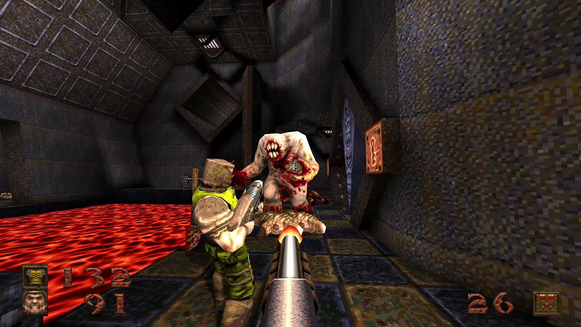
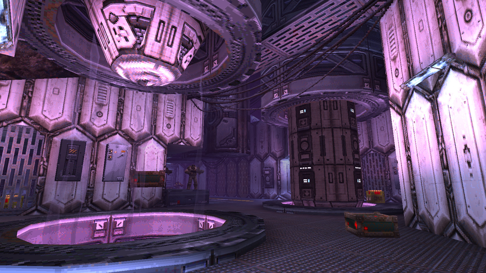
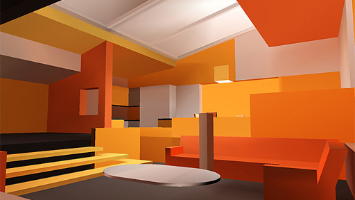
Flipping through the screenshots, I'm not sure if I would've went with such a noisy concrete texture for this, as it kind of muddies up the real star here -- the ambient occlusion on the surfaces, the subtle lighting. I also would've went with some more color too. Though maybe with this, he wanted to differentiate himself more from Rob Briscoe's Mirrors Edge abstract speedrun-floater level treatments, and break away from the legacy of GeoComp2 with its demand for very plain textures. I guess in the end, the difference is pretty trivial, as we're just two different flavors of modernists.

I'm taking a lighting design class right now, and it's remarkable how useless it is in the context of real-time game lighting solutions that have no concept of bouncing light or glare -- that's partly what an ambient term, SSAO, and HDR are supposed to simulate.

The paradox is even weirder the more I think about it. Commercial lighting design is all about avoiding harsh shadows, but in the days of the Source Engine, people were obsessed with mimicking the pitch-dark high-contrast shadow projections that aren't photorealistic nor terribly flattering nor well-stylized, yet are still subject to the weaknesses of static lighting. (My history: many were upset that Source didn't have stencil shadows like the other engines, unaware that Source's radiosity tool was much more futureproof anyway; Unreal ended up focusing on lightmap baking too.) It was like hitting no birds with two stones.

My lighting design instructor would cry if he knew what most of us have done: letting our technology fetish get in the way of good ol' artistic composition. However, I think he'd be okay with what the boys did on this very pretty level. Maybe I'll show it to him.

Also, I think Matthew "Lunaran" Breit should, um, share his CubeSpew Python script for Maya. Let's protest by joining servers running this map, and standing still. I propose the hashtag #OccupyLunaran.

Friday, February 3, 2012

Levels that make me want to start using UDK

I still really like Unity, don't get me wrong, but it'd be nice, sometimes, to be able to slather post processing on everything without breaking a sweat. Here are two UDK levels that are really awesome looking and don't rely on the default UDK assets, which is so much of the UDK stuff I see out there. (I also wish Dead End Thrills would feature indie work more often, like, 99% of the time.)

Animal Memory (Test 01), by Jack "Gauss" Monahan. Download here. Find all the pink cassette tapes, just like the cool kids in Tony Hawk games. My critique to him -- it's so postmodern cool-looking that I found the level very difficult to navigate. Masterful use of color and silhouettes though, of course. Next build, I believe, Mr. Monahan plans on adding mans to shoot.


Hubris, by Andrew Yoder. Download here. Not much to do here, other than walk around and be freaked out by the ambient sounds. He cites me (oh dear) and Dan Pinchbeck as his inspirations. The models and forms are technically very simple, and sometimes that's more of statement than fancy cubemapped parallax stuff. It's like Ico HD on acid.


Sunday, October 9, 2011

A level to look out for: l4d_yama

 
An epic Left 4 Dead project, made of so much custom content, deserves all the hype it can get. Unlike so many Japanese-themed FPS maps, this actually kinda looks authentically like Japan -- the author, Mark Edwards, clearly did his research -- and it's all pretty haunting if you think about the freakish chain of cataclysmic disaster that has swept Japan this year. Every empire is paranoid of its sunset, but the familiar real-life narrative of a shrinking population grants the setting some additional power. It's a rare digital survey of Japanese civilization: from city to countryside to castle.

Watch out for l4d_yama, people. The beta's hitting soon.

Monday, March 7, 2011

Levels to Look Out For (March 2011)

These are WIP / in-progress levels or environments that look cool + some comments / analysis on my part.

Forbidden Place (Planet?) by Bram "Pericolos0" Eulaers and Anders Jansson
This is an amazing looking single player Source thing that's probably been dead for 2 years, but it looks positively stunning. I love the "had a lot of fun in zBrush" rock cliffs. I love the purple crystals. I love how seamless the skybox is. I love how it barely looks like the Source Engine. (Message to the authors who will find this blog post in their link referrers: "PLEASE PICK THIS UP AND FINISH IT FOR THE LOVE OF GOD")


> Untitled (Bachelor Pad) by Ryan "Loom" Bargiel
I'm a sucker for flat shaded anything. I'm not sure I'd actually want to live in this private orange hell, but gosh this blockout looks cool. (Note: All games should be vertex lit... forever. If it was good enough for Final Fantasy 7, it's good enough for everyone else.) It's also gotten me thinking about "composition" in scenes because I really like the floorplan here and all the shots seem well built.

However, I often see people post screenshots with people painting onto it treating it like a static 2D frame. Is that treatment of composition still valid in a freely-explored 3D space, where the player controls a camera and might spend the whole time staring at a wall or stare at enemies? Do leading lines actually "guide the eye" when we're playing? (I'm skeptical, to say the least.) I mean, yes, it's better portfolio presentation, but is is better game design? How does architecture handle the issue of scene composition?

Monday, January 3, 2011

Levels to Look Out For (January, 2011)

These are WIP levels / env art that I liked, and most of them are hopefully close to release / are released. I command you to like them as well.

 > l4d_yama by Mark "the0rthopaedicsurgeon" Edwards
Four years in the making (?) and probably the most ambitious custom L4D campaign being made, surpassing even the impressive I Hate Mountains custom campaign. Whereas "I Hate..." was the work of three very handsome Europeans, l4d_yama is just a one-man effort, which is perhaps even more impressive. I've personally learned two important tricks from watching this map get made: (1) vignette the corners of a texture and add a subtle gradient to make it seem like one of those lightbox signs, as seen in the electric city section of this level, (2) use Propper once you've finalized level geometry to optimize everything, as Edwards did with all those signs in the alleys.

> "Tron Scene" by Joshua "Vassago" Stubbles
I featured the concept art last time, but here's the final product. I chose the wireframe screenshot because I liked the way he did the giant blue laser writer tower things. Specifically, the furthest one in the back is actually a sprite imposter. Final Fantasy XIII did this a lot too, the ol' "real 3D tree close to you but fake 2D sprite away from you" trick -- and here I didn't even suspect it. Also pay attention to his gorgeous use of matte painting in the background... Mobile devices these days, e.g. iPads, seem to have a lot of texture memory but not as much polygon pushing power. Expect more matte painters to find work in mobile games and a shift towards higher production photorealism. (If / when Square Enix does a Final Fantasy game for iPad, it's going to make Infinity Blade look like scribbles.)

Friday, December 3, 2010

Levels to Look Out For (December, 2010)

These are levels / environment art that I think are cool, and you should agree with me.

> UE3 Medieval Scene by Jordan Walker
This is what a next-gen Elder Scrolls: Oblivion (or the upcoming sequel) should look like... well, if Bethesda had the resources to hand-place every clump of grass. But that grass! Wow! (Turns out the secret is some shader talk about taking world position normals instead of face normals, or something...?)

> Chell's Legend by Jason "Generalvivi" Mojica 
I 'll be blunt: I don't like the screens with the super shiny normal-mapped spiral disk thing embedded in the walls. Valve usually avoided such heavy / blatant use of specular, I think, because it looks bad. Instead, Mojica's work is at its best (and most confident) when he isn't relying on a super-reflective prop_static to create visual interest; the "plainer" screenshots show great understanding of scale and form with a good balance of smaller and larger details. I love what he does with blocks and windows... Just, please, get a specular mask on that thing!

Saturday, October 30, 2010

Levels to Look Out For (November)

These are levels (or environmental art pieces), often WIP but not always, that I really liked -- and you should like them too.

» Polycount Sidescroller Beat 'Em Up Contest
I'm kind of cheating here as all the entries are already finished, but seriously... Look at all these entries. Whoa. There's some really technically accomplished stuff here, like a wartorn research lab by Vincent "ParoXum" Mayeur, as well as a futuristic catwalk with a really strong color palette by Zach Fowler -- but my vote went to the stylized fishing pier scene by Nate "Skeptical Nate" Broach and Loren "Keen" Broach. I think non-photorealistic styles are often much more difficult to pull off, as I mentioned last month with the TF2 moon level, but this flat style really knocked it out of the park for me. Really great use of texture space, smart balance of details, and a very readable environment that would be really functional for an actual game (the floor and background are very distinctive, crucial for side scrollers).


» Aladdin: The Fate of Agrabah by Eric Chadwick
Eric Chadwick did art direction for this 1996 PC game based on the Disney film. (Okay, so this is really really old. Whatever.) But classic design remains classic design; I could see this easily being an AAA iPhone game or Unity game today. So many technical constraints (limited texture memory, no lighting methods) but so many great solutions (the way they did the painted lighting, smart use of sprite imposters). Make sure you watch the flythrough, especially at the end -- including Mirror's Edge, so few games have the balls to use so much off-white in their environments... He's kinda right though. The city looks like Doritos.

Friday, October 1, 2010

Levels to Look Out For (October)

"Levels to Look Out For" are work in progress / recently released maps around the modding community. I like them, and you should like them too.


 > lun3dm5, by Matt "Lunaran" Breit and Andrew "KungFuSquirrel" Weldon
A classic Quake 3 Arena floater developed as a side project by an adorable environment artist-level designer duo that used to work at Raven Software but now at Lightbox Interactive. Inspired by the brutalist sci-fi paintings of Peter Gric, who apparently really likes concrete and ambient occlusion. The detail blocks are procedurally generated by a magical Python script / Maya thingmajig that will someday gain sentience and replace all game developers.


> Call of the Fireflies, by Clément "Corwin" Melendez
An atmospheric puzzle-based journey in Crysis. The visual mood is excellent -- I can practically hear the sound of silence, simply from looking at these screenshots. Unfortunately I can't vouch for the gameplay at all because I'll never own a copy of Crysis, but Corwin is doing a lot of testing so I'm sure it'll be just lovely.